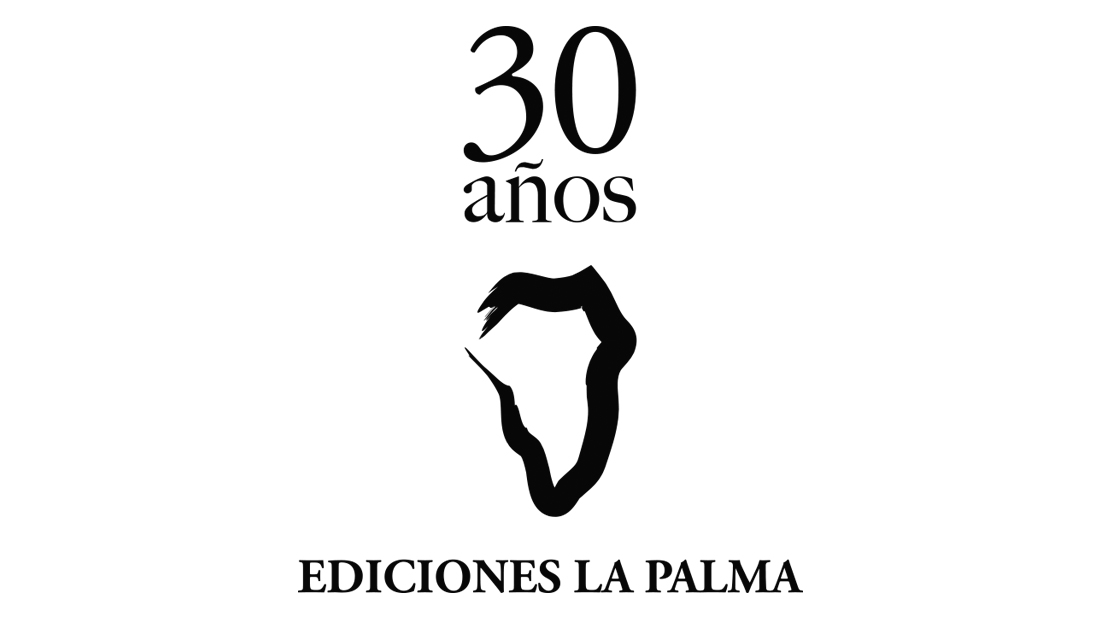
Ediciones La Palma logo redesign
Celebrating its 30th anniversary, Ediciones La Palma wanted to renew the image that has represented them during this first phase of their journey. The original design, by Facundo Fierro, was the trademark of the Cabildo de La Palma, which gave them permission to use it as a logo during these 30 years. For Elsa López, founder of the publishing house, after being accompanied by a silhouette in black, firm and precise, “the island, now, seems taken from the same sea and with the same contours as if it were real and emerged from the map in which it is located “.
For Elsa López, this is a new stage, more fertile and mature, where the entity, in the hands of writers and professionals of great prestige, continue to push the ship that carries a new logo that continues to be an island, but firmer, more secure and more resounding.
Following the indications of Elsa López, Manolo Cabrera and David Cabrera, who currently runs the publishing house, the logo starts from the outline of the island of La Palma and accentuates its curved, volcanic and maritime character. A version of the commemorative logo for their 30 years of life has also been prepared. We opted to continue with the existing typography, very classic, but giving a more modern treatment to the whole.
Ediciones La Palma began its activity in September 1989 at the initiative of Elsa López, doctor of Philosophy, anthropologist and writer. The brand name and emblem chosen for the publishing house reveal the close relationship of its founder with the island of San Miguel de La Palma (Canary Islands). Initially conceived as a family publishing house oriented to the publication of some authors of its environment, it soon grew to become a small commercial publisher, initially based in Madrid, at the home of Elsa López who, during the first years would deal directly with its management.
The first published title was Del amor imperfecto, a collection of poems by Elsa López that two years before had obtained the Poetry Prize “Ciudad de Melilla”. Since then, Ediciones La Palma has brought together into their catalog authors such as Cavafis, Octavio Paz, Antonio Gala, José Hierro, Claudio Rodríguez, José Ángel Valente and Domingo Pérez Minik. As well as a large number of renowned female authors such as Juana Castro, Pino Betancor, Sagrario Torres, Ángela Serna, Chantal Maillard, Chus Pato, Luz Pichel, Ángeles Mora, María Negroni or Dolores Campos-Herrero. Along with the names of new values of literature such as Diego Sánchez Aguilar, Alba Sabina Pérez, Ismael Belda, José Luis Correa, Covadonga García Fierro, Santiago Gil, Manuel Guedán, Valeria Correa Fiz and Juan Carlos Chirinos, in an insistent vocation to light new forms of expression.
Ediciones La Palma celebrates 30 years of dissemination and defense of literature and, above all, of Canarian literature, for which this publisher house opted from its inception. Here Here you can read an article by Elsa López about her first 30 years in the publishing industry. For many more!
Client
Date
diciembre 17, 2018
Category
Brand design, Graphic Design


 English
 Italian
 Spanish